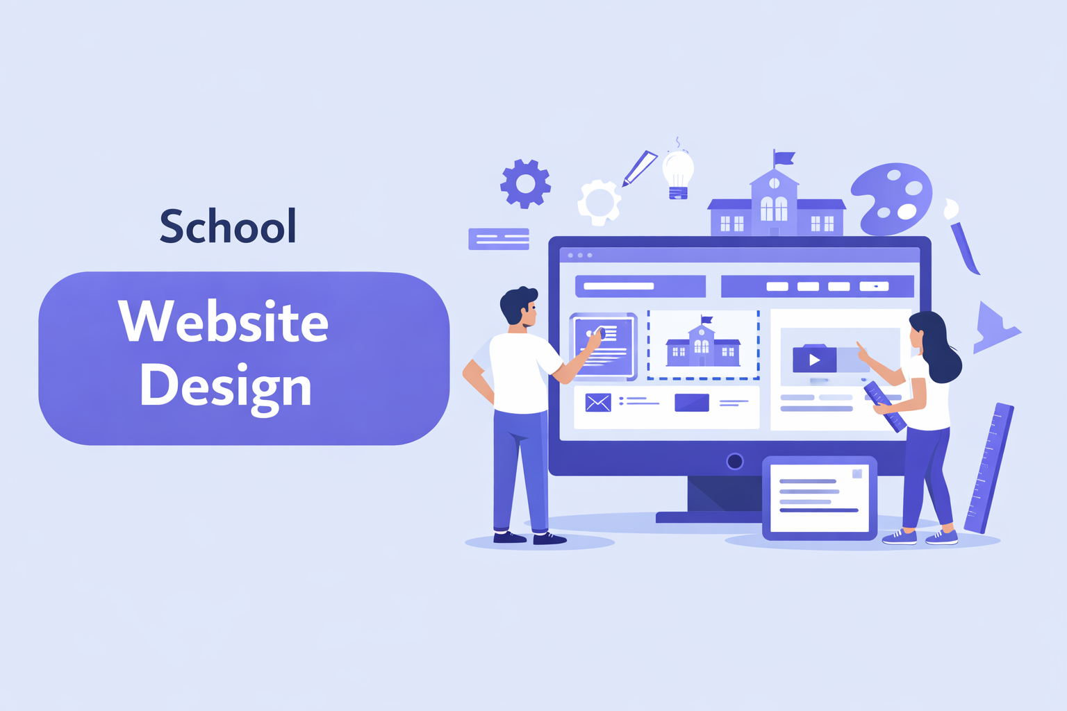
School Website Design – A Practical Guide for School Founders & Administrators
January 16, 2026
Your school website is often the first thing a prospective parent sees. Before they visit your campus, speak with you, or read a single review, they form an impression based on what they find online.
For many small private schools, hybrid homeschools, and non-traditional programs, school website design is an afterthought. Founders are busy building curriculum, hiring teachers, and managing enrollment. The website gets cobbled together quickly—and then neglected.
This is a mistake. A well-designed school website builds trust before you ever have a conversation with a parent. It answers questions, establishes credibility, and makes the enrollment process feel clear and approachable. A poorly designed website does the opposite: it creates doubt, confusion, and friction.
This guide covers what effective school website design looks like for small and growing schools. You don't need a large budget or a technical team. You need clarity about what matters and a willingness to keep things simple.
Why School Website Design Is Critical for School Growth
Parents research schools online before making contact. This is true whether you're a well-established private school or a brand-new microschool meeting in a community center.
Most parents will visit your website multiple times during their decision-making process. They'll look at it when they first hear about you, again before scheduling a tour, and often once more before submitting an application. Each visit is an opportunity to build confidence—or erode it.
How Parents Research Schools Online
The typical parent journey starts with a search. They might look for "private schools near me," "hybrid homeschool programs in [city]," or a specific school name someone recommended.
When they land on your website, they're asking themselves a few immediate questions:
- Is this a real, legitimate school?
- Does this seem like a good fit for my child?
- Can I easily find the information I need?
If your website doesn't quickly answer these questions, parents move on. They have other options, and their time is limited.
The Connection Between Website Design and Trust
Trust is built through clarity and consistency. When a parent lands on a school website that's well-organized, easy to navigate, and visually coherent, they assume the school itself is well-run.
This isn't always a fair assumption, but it's a real one. A confusing or outdated website signals that the school may be disorganized, under-resourced, or not paying attention to details. Whether or not that's true, the perception matters.
The Role of a Website in Enrollment Decisions
Your website isn't just a brochure. It's a tool that moves parents from curiosity to commitment.
A strong school website makes it easy to understand what the school offers, who it's for, and how to take the next step. It removes friction from the enrollment process rather than adding to it.
For small schools without a dedicated admissions team, the website does even more heavy lifting. It needs to answer common questions, set expectations, and guide parents toward action without requiring a phone call for every inquiry.
Understanding Your School Website Visitors
Before designing or redesigning your website, it helps to think about who will use it and what they're trying to accomplish.
What Parents Expect From a School Website
Parents visiting your website want three things:
Clear information. They want to understand your school's philosophy, programs, schedule, and tuition. They shouldn't have to dig through multiple pages or guess what you offer.
Easy navigation. They want to find what they're looking for quickly. If they can't locate admissions information or contact details within a few clicks, they'll assume the school is harder to work with than it should be.
Proof of legitimacy. They want to see that this is a real school with real students and a real track record. Photos, accreditation details, and testimonials all contribute to this sense of credibility.
What Students and Staff Look For
While parents are the primary audience for most school websites, don't forget about students and staff.
Students (particularly older ones) may visit the website looking for information about academic programs, extracurricular activities, or school schedules. Staff and prospective employees may look for information about the school's mission, leadership, or employment opportunities.
If your school uses a separate portal or system for day-to-day communication, make sure it's easy for returning users to find the login link. A simple "Parent Login" or "Staff Portal" link in the header or footer prevents confusion.
Core Elements of Effective School Website Design
Good school website design isn't about trends or flashy features. It's about making information easy to find and building trust through clarity.
Simple Navigation and Clear Structure
Your website's navigation is the backbone of the user experience. If parents can't figure out where to click, they won't stay long.
Keep your main menu simple. Most school websites need only five to seven top-level items:
- Home
- About
- Admissions
- Academics
- Contact
You can add submenus for additional detail, but resist the urge to include everything in the main navigation. More options create more confusion.
Organize your content the way a parent would think about it, not the way your internal org chart is structured. Parents don't care about your departmental divisions—they care about finding answers.
Mobile-Friendly and Responsive Design
More than half of your website visitors will be browsing on a phone. Many parents check school websites during lunch breaks, while waiting for appointments, or after putting kids to bed.
A mobile-friendly website isn't optional. It's essential.
Responsive design means your website automatically adjusts to fit different screen sizes. Text should be readable without zooming. Buttons should be large enough to tap easily. Forms should be simple to complete on a small screen.
If your current website is difficult to use on mobile, this should be a top priority to fix.
Visual Design That Builds Trust
Visual design matters, but not in the way many people think. You don't need a cutting-edge design or expensive custom graphics. You need a clean, consistent look that feels professional.
Use your school's branding consistently. Your logo, colors, and fonts should appear throughout the site. Consistency signals that someone is paying attention.
Use real photos whenever possible. Authentic images of your campus, classrooms, and students (with appropriate permissions) are far more effective than generic stock photos. Parents want to see what your school actually looks like.
Avoid visual clutter. White space is your friend. Dense pages with competing elements overwhelm visitors and make it harder to absorb information.
Essential Pages Every School Website Must Have
Every school website needs certain foundational pages. These are the pages parents expect to find and will look for immediately.
Home page. This is your front door. It should quickly communicate who you are, who you serve, and what makes your school distinctive. Include a clear call-to-action, such as "Schedule a Tour" or "Start Your Application."
About the school. Share your mission, philosophy, history, and leadership. Parents want to understand what drives your school and who's running it. This page builds trust and helps families determine if your values align with theirs.
Admissions and enrollment. Make the admissions process transparent. Explain the steps, timeline, and requirements. If you have tuition information available, include it—parents appreciate transparency about cost.
Academics and curriculum. Describe your educational approach, grade levels, and programs. Parents want to understand what their child will learn and how. Be specific enough to be useful without overwhelming visitors with details.
Contact and location. Include your address, phone number, email, and hours. Embed a map if possible. Make it obvious how to get in touch.
News, events, or announcements. A blog or news section shows that your school is active and engaged. Even occasional updates signal that someone is maintaining the site. If you can't commit to regular updates, keep this section simple or skip it entirely—an abandoned blog does more harm than good.
School Website Design Best Practices for Solo Founders
If you're running a small school without a dedicated marketing or IT team, your website needs to be manageable. Here's how to balance professionalism with practicality.
Choose a platform you can update yourself. You shouldn't need to contact a developer every time you want to change your office hours or post an announcement. Modern website builders make it easy for non-technical users to maintain their own sites.
Start with templates, then customize. You don't need a custom design from scratch. Many website platforms offer clean, professional templates designed for schools or small organizations. Start with one of these and adapt it to your branding.
Focus on content first. Before worrying about design details, make sure you have clear, well-written content for each essential page. Good content on a simple template is more effective than weak content on an expensive custom site.
Plan for maintenance. Your website will need updates. Build a habit of reviewing your site quarterly to check for outdated information, broken links, and content that no longer reflects your school accurately.
Common School Website Design Mistakes to Avoid
Even well-intentioned school websites often make the same mistakes. Avoiding these pitfalls will put you ahead of most small schools.
Overloading pages with information. More content isn't always better. Dense pages with long paragraphs and multiple competing messages overwhelm visitors. Break content into digestible sections and cut anything that doesn't directly serve the reader.
Missing calls-to-action. Every page should guide visitors toward a next step. If someone reads your admissions page and wants to apply, make sure the button to do so is obvious. Don't assume parents will hunt for it.
Outdated content. Nothing undermines trust faster than a website that still mentions last year's events or lists faculty who left two years ago. If you can't keep a section current, remove it.
Unclear messaging. Parents shouldn't have to guess what your school does or who it's for. If your homepage could describe any school, it's too generic. Be specific about your approach, your students, and what makes you different.
Burying contact information. Some schools make it surprisingly difficult to figure out how to get in touch. Your phone number, email, and address should be easy to find from any page—ideally in the header or footer.
How School Website Design Impacts Enrollment
Your website is an enrollment tool. Every design decision should be evaluated against a simple question: does this make it easier or harder for the right families to find us, understand us, and take the next step?
Clear enrollment paths. Don't make parents click through five pages to figure out how to apply. The path from "I'm interested" to "I've submitted an inquiry" should be short and obvious.
Prominent calls-to-action. Buttons like "Schedule a Tour," "Request Information," or "Apply Now" should appear in multiple places throughout your site. Don't rely on parents to find the admissions page on their own.
Design elements that encourage action. Testimonials from current families, photos of engaged students, and clear descriptions of your admissions timeline all reduce hesitation and encourage parents to move forward.
For schools using student information systems like TeachHero, connecting your admissions workflow to your website can streamline the process further. When parents can submit inquiries or applications through a simple online form that flows directly into your school's management system, you reduce manual work and create a more professional experience.
Accessibility and Readability in School Website Design
A well-designed website is usable by everyone, including visitors with disabilities, those using older devices, and people who simply prefer straightforward content.
Font size and contrast. Text should be large enough to read comfortably and have sufficient contrast against the background. Light gray text on a white background might look elegant, but it's hard to read.
Simple language. Write at a level that's accessible to all parents, regardless of education level or familiarity with educational jargon. Avoid acronyms and insider terminology.
Logical structure. Use headings to organize content. This helps all readers scan pages quickly and is essential for users who rely on screen readers.
Alt text for images. Every image should include a brief description for users who can't see it. This is both an accessibility requirement and good practice.
Accessibility isn't just about compliance. It's about respect for your visitors and a commitment to clear communication—values that should be central to any school.
Choosing the Right Platform for Your School Website
You have many options for building and hosting your school website. The right choice depends on your budget, technical comfort, and long-term plans.
Website builders (like Squarespace, Wix, or Weebly) are designed for non-technical users. They offer drag-and-drop editing, built-in hosting, and templates that work out of the box. For most small schools, a website builder is the fastest and most affordable path to a professional site.
Content management systems (like WordPress) offer more flexibility and customization but require more technical knowledge to set up and maintain. WordPress can be a good choice if you have someone on staff with web development experience or plan to hire outside help.
Custom development is rarely necessary for small school websites. Unless you have very specific requirements that can't be met by existing platforms, the cost and complexity of custom development aren't justified.
When evaluating platforms, consider:
- How easy is it to make updates yourself?
- What are the ongoing costs (hosting, domain, premium features)?
- Can the platform grow with your school?
- Does it offer responsive, mobile-friendly templates?
Future-Proofing Your School Website
Your school will change over time. Your website should be able to change with it.
Build with flexibility in mind. Choose a platform and structure that allows you to add new pages, update content, and adjust the navigation without rebuilding the entire site.
Plan for new features. You might want to add an events calendar, a parent portal, or online payment options in the future. Consider whether your chosen platform can support these additions.
Review and refresh regularly. Set a schedule for reviewing your website—at minimum, once per semester. Check for outdated content, broken links, and pages that no longer reflect your school accurately.
Keep your core pages evergreen. Your mission statement, educational philosophy, and contact information shouldn't need frequent changes. Write these pages with longevity in mind.
Conclusion
School website design is a strategic investment, not a technical afterthought. For small schools, hybrid programs, and non-traditional learning environments, your website is often the first and most important touchpoint with prospective families.
You don't need a large budget or a design team to build an effective school website. You need clarity about what information parents need, a commitment to simplicity, and the discipline to keep your content current.
Start with the essentials: a clean design, clear navigation, and well-written content on the pages that matter most. Add complexity only when it serves your visitors. Remove anything that doesn't.
A well-designed website won't do your enrollment work for you. But it will make every other part of the process easier—for you and for the families considering your school.
Frequently Asked Questions
What is the most important part of a school website?
Clarity. Parents should be able to understand what your school offers, who it's for, and how to take the next step within seconds of landing on your site. Everything else—design, features, content—serves this goal.
Can a small school manage its own website?
Yes. Modern website builders are designed for non-technical users. With a few hours of initial setup and a quarterly review habit, most small school teams can maintain a professional website without outside help.
How often should a school website be updated?
Review your website at least once per semester. Check for outdated information, broken links, and content that no longer reflects your school. Major changes—like new programs or leadership—should be updated immediately.
What makes a school website trustworthy for parents?
Real photos, clear information about leadership and accreditation, testimonials from current families, and a professional design all contribute to trust. Consistency matters too—if your website looks polished and current, parents assume your school is well-managed.
Is mobile design necessary for school websites?
Absolutely. More than half of parents browse school websites on their phones. If your site is difficult to use on mobile, you're creating friction at the exact moment you should be building trust.